
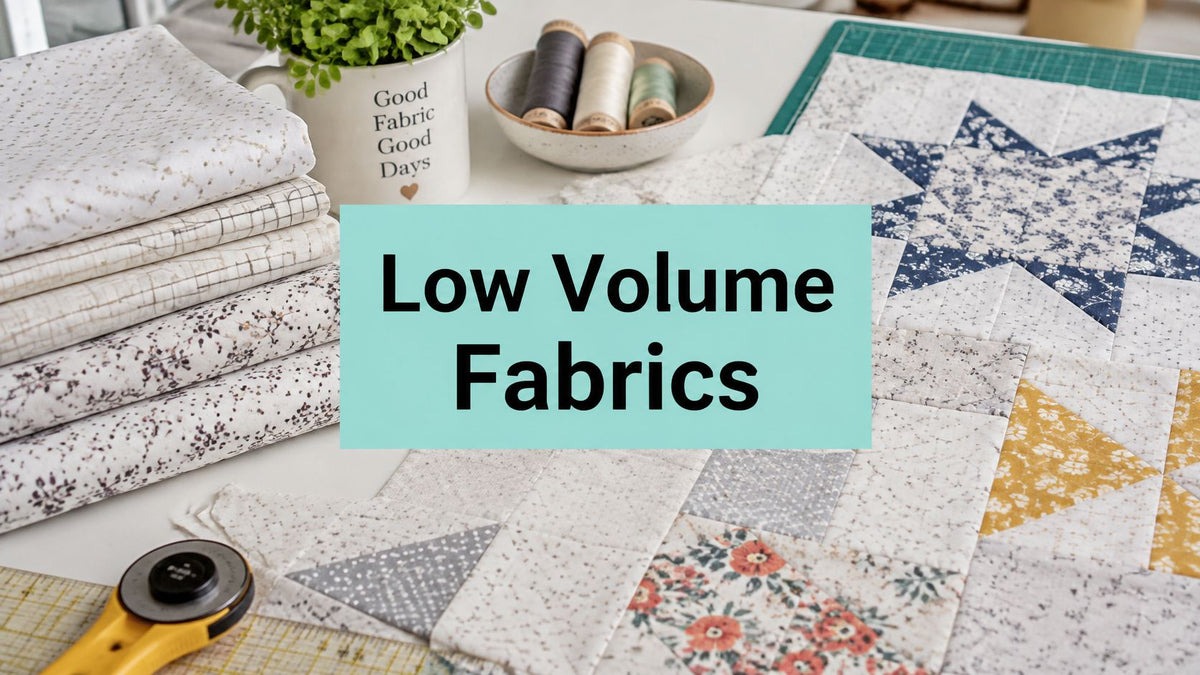
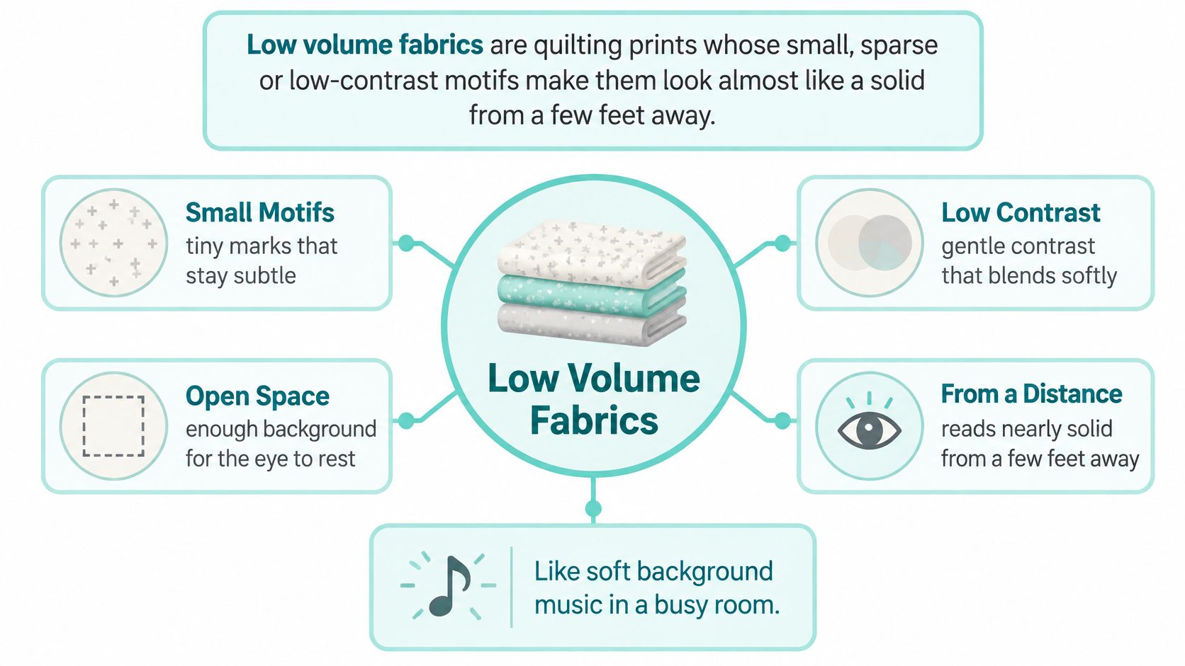
Low volume fabrics are quilting prints whose small, sparse or low-contrast motifs read almost like a solid from a few feet away.
You're standing at the design wall with a stack of bold prints that all look great on the bolt and fight each other once they're sewn. The blocks blur, the seams vanish, and the one fabric you wanted to feature gets lost in the noise. That is the exact problem a quiet background solves, if you test value before you cut.
What Are Low Volume Fabrics?
Low volume fabrics are quilting prints whose small, sparse or low-contrast motifs make them look almost like a solid from a few feet away. Think of a low volume print as the quiet voice in the room. It doesn't compete, so your focal fabrics can be heard.
That label is a design category, not a fiber, weave or color standard. As the HC Quilts guide to low volume quilting fabrics explains, it's defined by perceived value and visual density, with a pale ground in white, cream, gray, beige or another muted neutral carrying dots, text, fine grids or tiny florals. Step back or look in grayscale and that print should resolve into a near-solid.
Quilters have always stretched limited cloth, so understated prints had practical value long before anyone used this label. A quiet fabric could fill background, join scraps and stretch a favorite print further. If you want a motif made specifically for that job, you can also explore custom fabric printing options and keep the scale small enough to pass the distance test.
Our shop works in the same quiet-versus-loud language on the plush side, since OPN Quilting carries Shannon Fabrics textures that read as calm fields next to busy piecing. The sorting skill is identical whether the surface is cotton or pile. Judge what you see from six feet, not what charms you at six inches.
How fabric types read in a quilt
| Fabric type | Look from a few feet away | Role in a quilt | Typical example |
|---|---|---|---|
| Low volume print | Reads almost like a solid | Background, sashing, negative space | Pale ground with small dots, tiny text or a fine grid |
| Solid or tone-on-tone | Flat, no visible motif | Strongest quiet field, can look stark | Plain muted cream or gray cotton |
| Medium-scale print | Clearly patterned | Secondary print or supporting block | Mid-size florals or geometrics |
| Large-scale print | Bold motif dominates | Focal fabric or border statement | Oversized florals or novelty prints |
Use that table on your own stash before you shop. Pull ten bolts, step back, and assign each one to a row. If you can label every bolt without squinting at the motif, you've sorted your stash the way the quilt will be seen.
How Do You Run a Phone Value Test?
A low volume print passes when it still reads quiet once its color is removed. Color lies to you at the cutting table. Value doesn't.
The five-step check
- Photograph everything together. Lay the candidate and every focal print on one table under the same window light, then shoot in black and white or grayscale.
- Step back four to six feet. Look at the phone or the samples again. Small motifs should blur into a near-solid while the focal print keeps its edges.
- Test the seam line. Place a 2.5-inch sample beside the focal fabric. If you can't see where one ends and the other begins, the values are too close.
- Cut at finished size. Cut one test square at the finished unit size and repeat the distance check, because a sparse motif can concentrate once it's cut.
- Decide yes or no. Buy it only if it stays subordinate in every check. A dark cluster or a value match means you drop it or move it to sashing.
Run that sequence before any rotary cutter comes out and you'll save the yardage you'd otherwise waste on a background that fights your blocks. Our post on modern quilt color schemes shows the same value-first thinking applied to full palettes, and it's worth reading beside your test photos. One phone photo, judged carefully, beats an hour of unpicking.
How Low Volume Prints Create a Quiet Background
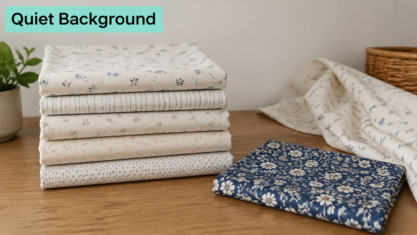
Visual density is how much ink hits your eye per square inch. Widely spaced, low-contrast marks leave open space, so the eye rests. Dark clusters or oversized motifs grab attention and turn a background into a feature.
A nine-patch that works
Say you piece a scrappy nine-patch in saturated blues and oranges and set it on a pale low volume ground with a faint grid. From across the room the ground reads as one calm field. Each colored square keeps crisp edges and full color because nothing behind it is competing.
Swap that ground for a busy medium floral and the same blocks fall apart visually. The orange squares fight the floral's reds, the blue squares lose their corners, and you read texture instead of geometry. The piecing didn't change. The background stole the job.
A background earns its place by making the block next to it easier to see.
The two failure modes
- Too close in value. When the ground sits near the focal fabric in grayscale, seams and block geometry vanish. Your careful points disappear into a wash.
- Too light and too contrasty. A ground that's dramatically brighter than everything else pulls focus to itself. The eye goes to the empty space instead of the piecing.
There's a third trap at the cutting table. A motif that looks sparse on the bolt can concentrate into a bold fragment once it's cut into a 2.5-inch square, so judge repeats at finished unit size, not off the roll.
Narrow low volume sashing uses the same principle at smaller scale. It separates blocks and gives each one a clean frame without adding a competing pattern. Our guide to white on white fabric covers the quietest end of that range if your blocks need maximum separation.
Watch how a quiet ground changes a block's read in the demonstration below.
Once you can name why a block works, you can predict which fabric will steal the show before you sew a single seam. That's the whole skill. Everything else is shopping.
How to Pair Low Volume Prints With Other Fabrics
Start with the core rule. Keep the value range narrow and vary the motif geometry. Two prints can sit at the same pale value yet read as different textures when one carries a faint grid and the other carries sparse dots.
The payoff is visual balance, as described in this stash-building guide from Sherri Quilts a Lot, because the eye reads the low volume field as one coherent background while adjacent feature fabrics keep their edge definition. You're buying rest for the eye, not another pattern to admire up close.
Pairing low volume motifs by type
| Motif type | Scale on the bolt | Pairs well with | Avoid pairing with |
|---|---|---|---|
| Faint grid | Fine, sparse lines | Sparse dots and tiny text | Dark or dense checks |
| Sparse dots | Small, widely spaced | Faint grids and small florals | Large dense polka dot clusters |
| Tiny text or script | Very small, low contrast | Pale solids and fine grids | Oversized lettering |
| Small floral | Tight but pale | Dots and grids of similar value | Dark floral clusters |
| Pale tone-on-tone | Almost solid | Any low volume print in a narrow value range | Dark neutrals |
A mixing sequence that stays quiet
Choose one anchor print first, the quietest of the group. Add a second print with a different mark type, dots against your grid, and check them side by side in grayscale. Add a third only if it stays within the same pale value as the first two, and run the phone value test on each candidate before you cut anything.
You can shop the pale print lineup at OPN Quilting with that sequence in mind, picking by mark type instead of by color name. If you're mixing in stronger prints for contrast, our piece on batiks by design helps you judge which saturated fabrics will hold their own against a pale field.
Small motifs suit patchwork for a practical reason. They keep their identity after cutting into half-square triangles, sashing and narrow strips. Large repeats split into distracting fragments, so a petal here and a stem there reads as damage rather than pattern.
Don't stack two dense motifs in the same background. Paired together they form repetitive dark bands across the quilt, and the eye follows the bands instead of your blocks. Leftover strips from a rejected pairing aren't wasted, though, and these fabric craft ideas from Pinwheel Crafts give small remnants a second job.
Finish with three prints that add texture without noise. Test them on one block first. If that block reads clean from across the room, cut the whole quilt with confidence.
Which Low Volume Fabric Works for Backgrounds?
Sort the choice by placement first, because placement sets how quiet the print has to be. A fabric that behaves beautifully in sashing can overwhelm a full background. The same print, wrong address, wrong quilt.
Which low volume placement needs which print
| Placement | Print quietness needed | Motif scale | Example |
|---|---|---|---|
| Background | Quietest, reads almost solid across the quilt | Tiny, very sparse marks | Pale tone-on-tone or fine dots |
| Sashing | Quiet, narrow strips keep the print from overpowering blocks | Small to medium | Faint grid or sparse dots |
| Border | Use only when the quilt needs surface texture, otherwise a stronger border frames it | Medium | Small floral in a pale ground |
| Cuddle quilt back | Textured solid in soft pile reads as a quiet field | Not a print | Shannon Hide, Snowy Owl or Fawn |
A large background needs the quietest print you own, the one that holds together as a near-solid across a full top. The failure mode is specific: a medium-contrast print that looked harmless on the bolt starts producing light and dark patches once it covers sixty inches, and those patches compete with your blocks. Sashing can carry a little more motif because narrow strips physically limit how much pattern shows at once. Borders are the exception, since a stronger frame often serves the design better than another whisper.
The plush side of the same decision
For a throw or a quilt back, a textured solid does the same job in pile instead of quilting cotton. Shannon's Hide, Snowy Owl and Fawn textures read as a quiet field while adding the softness people feel. If you're weighing pile heights, our explainer on what Cuddle minky fabric is breaks down the difference between Cuddle and Luxe Cuddle.
These textures are a practical choice for backs and throws, and OPN has hundreds of verified reviews from quilters and gift-makers to check before you commit a yardage to a queen-size back.
Three questions before you buy
- Where does it sit? Background, sashing, border or back decides the quietness you need.
- What must stay focal? Name the block or print that has to win, then protect it.
- Does it pass in black and white? If it doesn't read quiet in grayscale, it won't read quiet in the quilt.
Get 15% off your first order, plus free U.S. shipping on orders over $70.
Answer those three and the placement table does the rest. You're no longer guessing at the bolt. You're assigning a job.
How Do You Check Low Volume Fabric Colorfastness?
The fear is specific. You wash the finished quilt and a pale block comes out pink or gray. Low volume fabrics show dye transfer faster than any dark print, so this check matters more here, not less.
Colorfastness isn't judged by appearance. It's tested against separate stresses, including washing, light and rubbing, and a fabric can pass one while failing another. The QIMA guide to colorfastness test methods explains that ISO 105-C06 uses a single-test format for one wash cycle and a multiple-test format simulating up to five wash cycles with increased mechanical action, assessing both color loss and staining on adjacent fabric.
Fiber choice shifts the odds. According to the EUROLAB overview of color fastness in textiles, polyester generally shows better colorfastness than cotton or wool, although dye, finish, construction and exposure still decide the result. That same source notes lightfastness uses a 1-to-8 scale rather than the 1-to-5 scale used for most other fastness tests, so a strong wash result doesn't prove a sunny window is safe.
Colorfastness test by how the quilt will be used
| Use | Stress to test | Test or scale | Why it matters |
|---|---|---|---|
| Quilt or throw that will be laundered | Washing, color loss and staining onto neighbors | ISO 105-C06 | Pale blocks can pick up dye from darker prints |
| Quilt displayed in a sunny window | Light exposure | Lightfastness, scored 1 to 8 | A wash result does not prove light resistance |
| Quilt handled or rubbed often | Rubbing (crocking) | Rubbing test | Dye can transfer onto light backgrounds |
For a back that will be laundered often, Shop the Luxe Cuddle Collection and favor polyester pile over an untested pale cotton. Our own notes on color fastness testing walk through how we think about wash results for quilt backs. The same staining logic applies beyond quilts, which is why the Lewis and Sheron Textiles tablecloth guide is useful reading for any pale fabric headed for regular washing.
Ask one question before you buy. Does the seller hold test results for this specific fabric? If they can't answer, prewash a sample with a white cloth and see for yourself.
Mistakes That Sink Low Volume Quilts
The costliest mistake is judging by color instead of value. A pale pink and a pale gray can look like a pair on the bolt, then separate badly in grayscale. Run the phone value test first, every time.
Second, two busy low volume prints in one quilt form dark bands across the top. Keep one print as the anchor and let the second carry a clearly different mark type. Texture comes from contrast in geometry, not from density.
Third, buying a coordinated assortment without a plan wastes fabric and money. The UNEP release on textile waste notes that about 15% of fabric used in textile production is estimated to be lost during cutting, so list your offcuts before you buy. Reserve strips for pieced backgrounds, crumb blocks, binding and test blocks, then shop only the yardage the plan needs when you order from OPN Quilting.
One test block catches all three problems for the price of a fat quarter. Sew it, photograph it, step back. Then commit.
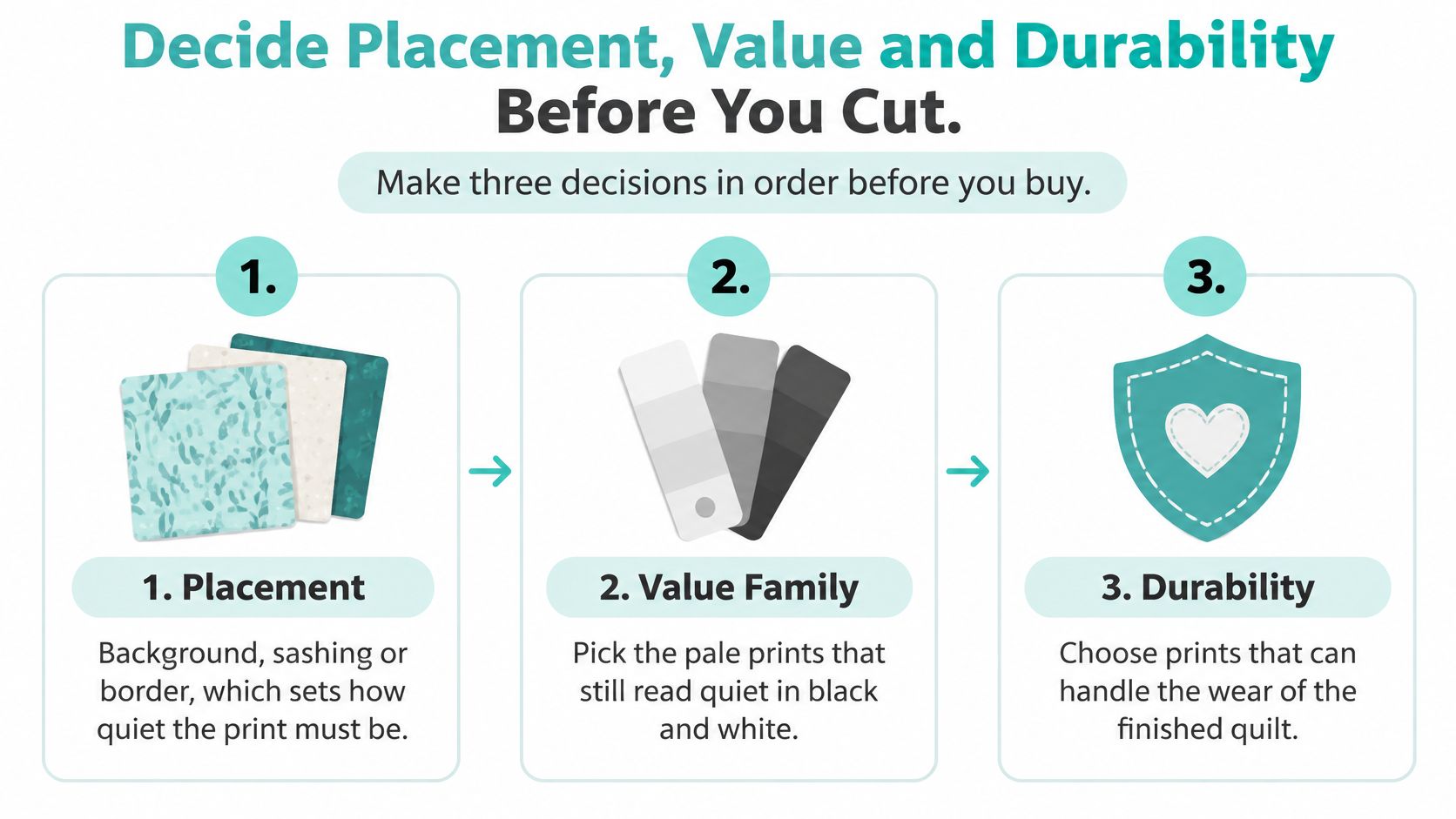
Decide Placement, Value and Durability Before You Cut
Make three decisions in order before you buy.
- Placement. Background, sashing or border sets how quiet the print must be.
- Value family. Pick pale prints that still read quiet in black and white, confirmed with the phone test, then Shop the Luxe Cuddle Collection for backs that hold that same calm field in pile.
- Durability. Decide whether the quilt will be washed, displayed in strong light or handled often, then match it to the right colorfastness test.
Pin your candidates up while you decide, using the method in our guide to a design board for quilting, so distance does the judging for you. On the plush side, we stock Shannon Fabrics Cuddle and Luxe Cuddle in 44-45 inch quilting widths plus extra-wide 90 and 110 inch options, so big backs need fewer seams.
Once your top is finished, our mail-in longarm service can take it from there. Read our longarm quilting prep tips before you ship, then Book Your Longarm Service Today. Placement, value, durability, in that order, and low volume fabrics will do exactly the quiet job you hired them for. Get 15% Off Your First Order when you're ready to buy.
On Pins & Needles Quilting Co. stocks the Shannon Fabrics Cuddle and Luxe Cuddle textures, extra-wide backings and mail-in edge-to-edge longarm quilting that turn a well-tested low volume top into a finished, washable quilt. Bring us your placement, value and durability decisions and we'll help you match them to the right fabric and finish. Start your next quiet background at On Pins & Needles Quilting Co.