
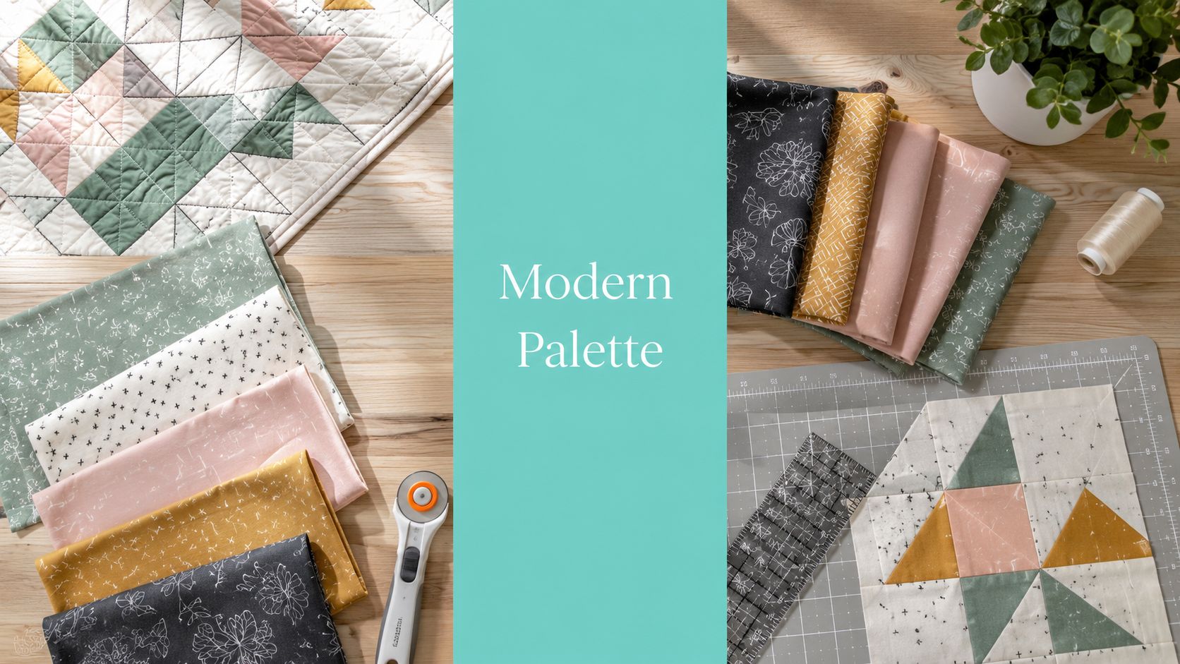
You're standing at the cutting table with four pretty fabrics in your hands, and the quilt still looks wrong. Modern quilt color schemes only work when value, contrast, and proportion do the heavy lifting, not just pretty colors. If you skip that system, the top can turn muddy fast, especially once the pieces get small and the quilt gets judged from across the room.
Why Most Modern Quilt Color Schemes Fall Flat
The most common mistake is simple, picking colors before checking value. Quilters fall in love with individual bolts, lay them out, and only later notice that the quilt reads as one flat blur instead of a clean modern composition. That's why modern quilts need a system, not a wish list.
Start with what the eye can read first
Modern quilts usually depend on bold colors, high contrast, and large areas of negative space, often with grey or white backgrounds, according to Carolina Oneto's description of the Modern Quilting Movement (source). That look disappears when every fabric sits in the same visual middle. A quilt can be full of nice prints and still feel old-fashioned if nothing separates clearly.
Here's the filter I use when I'm looking at a palette at the shop counter:
- Value first: Ask whether the fabrics still separate when you squint.
- Contrast second: Make sure at least one fabric pulls forward and one recedes.
- Proportion third: Keep the loudest fabric under control so it doesn't run the whole top.
Practical rule: If the quilt only works when the fabrics are named out loud, the palette isn't strong enough.
A lot of modern-quilt teaching circles back to the same point, value separation is what makes the design readable. A strong geometric layout can handle a surprising amount of color, but it can't rescue weak value contrast. That's why a quilt that looks exciting on the design wall can still look soft or muddy after it's trimmed and bound.
The fastest way to reject a bad palette is to ask one question, “Can I still read the design from six feet away?” If the answer is no, the colors aren't the problem, the structure is. Keep your pretty fabrics, but rebuild the palette around value instead of around favorites. For more modern examples, I'd start with our modern quilting design ideas and look at how the layouts use negative space on purpose.
Value, Saturation, and Contrast Explained Simply

Value, saturation, and contrast sound academic, but in the sewing room they're just three dials you can turn. Value is light versus dark, saturation is vivid versus muted, and contrast is the difference that makes the design pop. If you can control those three, you can control the whole quilt.
What each dial changes in a finished top
Value is the first one I check because it decides whether the blocks read at all. Quilting guides commonly suggest squinting at fabric or viewing it in black and white, and that advice is solid because it strips away the temptation to chase hue instead of structure. If the prints collapse into the same gray, they're too close in value to carry a modern design.
Saturation changes the mood. A quilt can still feel modern with muted colors if the value contrast is strong, and it can look chaotic if every bright fabric fights the others. Expert quilting guidance also points out that placing a bright next to a neutral, or next to a darker or grayer version of the same hue, reduces color vibration while keeping the palette lively (source).
Contrast is what gives modern quilts their clean punch. Two fabrics can both be bright and still argue with each other if they're the same intensity and sitting too close together. That's where tints, tones, and shades earn their keep, they cool a palette down without killing the energy.

The old wheel is useful, but it's not enough. Recent quilting commentary keeps circling back to the same practical gap, people want bold palettes, but they also want them to stay readable, and that means mixing brightness with value control and neutral buffers (source).
Use this rule on every pull, if the quilt only has hue variety but no real light/dark difference, it's not ready.
For a fast sanity check, I like keeping a color fastness testing reminder in mind before I commit to any strong contrast combo, because washed fabric that shifts color can wreck an otherwise careful palette.
Building Your Palette From One Hero Print
A good modern quilt often starts with one hero print, but the print has to do real work. It should tell you the palette direction, set the tone, and keep you from pulling a stack of fabrics that look fine on the cutting table and dead once they are stitched, quilted, and washed. The strongest quilts are not built from random pretty bolts. They are built from one fabric that already contains the color story.
Let the print make the decisions for you
The cleanest way to work is to let the hero print set the roles. Keep the strongest color as the anchor, use a quieter fabric to support it, and save one accent for the place where the eye should stop. That lines up with 60/30/10, about 60% dominant color, 30% support color, and 10% accent color (source). Another quilting workflow uses the same logic by starting with one focus fabric and then checking for a clear light, medium, and dark range before any cutting begins (source). The method works because it keeps the palette organized without making it stiff.
Do the pull in this order.
- Pick the hero fabric first. Choose the print that sets the mood for the whole quilt.
- Pull from the colors already inside it. Stay inside the print's own family instead of forcing a new direction.
- Leave room for one accent. It should add a sharp note, not take over the block design.
- Check value before you cut. If the light, medium, and dark fabrics blur together, the top will read flat.
Shop-floor truth: A beautiful print that disappears into the rest of the bundle will not carry the quilt.
The mistakes are easy to spot from a distance. Quilters skip the value check, stack prints that all read the same once they are across the room, or add an accent that is so loud it breaks the rest of the palette. That is how a quilt starts looking cluttered instead of modern. Pull a small test group first, stand back, and decide whether the mix still reads cleanly before you cut into yardage.
Charm packs are useful here because they show you quickly whether the colors hold together in a smaller spread, and charm pack planning ideas make that kind of trial easier to judge. If you are torn between two directions, try ColorBestie's coloring assistant to compare them side by side before you commit to the full fabric pull.
Four Curated Modern Palettes With Real Use Cases
A modern quilt can miss the mark even when the colors are good on paper. The front may look balanced, then the backing, the texture, or the quilting thread changes the whole read. Choose the palette as a system, not a stack of pretty fabrics.
Four palettes that finish well
| Palette | Dominant / Secondary / Accent | Best For |
|---|---|---|
| Baby Modern | Soft sage / warm white / dusty blush with a butter accent | Baby quilts that still feel current |
| Modern Minimal | Charcoal / ivory / muted ochre | Graphic quilts with a calm, gallery-like read |
| Bold Improv | Electric teal / deep plum / off-white with a lime pop | Improvisational tops that need energy without chaos |
| Extra-Wide Backing | Mocha backing / olive top / copper accent / sandy neutral mid | Large quilts where the back has to match the modern front |
Baby Modern should feel airy, not sweet. If you overload it with blush and skip the light value, it turns sentimental fast. A better version uses warm white as the background, sage to anchor the composition, and just enough butter to keep the eye moving. That is the kind of palette where try ColorBestie's coloring assistant helps you sort out whether the soft notes still read modern before you buy yardage.
Modern Minimal is easy to flatten if the contrast is weak. Charcoal and ivory can look sharp, but they need a deliberate third note, and muted ochre is the one that keeps the palette from feeling cold. If the quilt top is staying restrained, I'd pair it with a backing from Shannon Fabrics minky and Luxe Cuddle options so the finish has depth without stealing the show.
Bold Improv needs discipline. Electric teal and deep plum are strong enough on their own, so the off-white matters more than the accent. The lime pop should be small and surgical, not sprayed across the whole top. This is the palette that looks modern when every color has a job and no fabric is trying to carry the whole quilt.
Extra-Wide Backing is where a lot of good quilts get let down. The front can be balanced, but the back can still fight it if the color is too cool, too dark, or too busy. For large projects, I'd look at extra-wide minky backing options so the back finishes cleanly without seam drama.
If you want to sanity-check a palette before buying, try a quick color pass with OPN's fabric planning mindset and compare it to the palette table above. For quilts that need a soft backing with enough body to hold the design together, use what Cuddle minky fabric is and how it behaves as your quick reference before you choose the final layer.
Practical rule: If the accent is the first thing you notice, it's too big.
Pairing Minky Textures With Modern Palettes
A modern quilt can look right on the top and still miss the mark after it is backed. The backing changes the read. Texture changes it again. A sharp palette in cotton can turn soft, even sleepy, once you choose the wrong minky, so the finish needs to be decided as part of the color plan, not after the fact.
Texture changes how color lands
Shorter-pile textures read cleaner and flatter, so they fit simple geometric layouts. Plush textures soften edges, which works well when the top is bold and the backing needs to quiet it down. A Luxe Cuddle backing in Snowy Owl can soften a Bold Improv top without making it feel childish, while a moody Mirage or Hide texture gives a Modern Minimal quilt more depth.
Use the texture to support the palette, not compete with it. A simple geometric top needs a restrained surface so the lines stay crisp. A busy improv top can handle a plusher backing because the softness takes the edge off without dulling the design. For a Baby Modern palette, Hide or Fawn in a deep neutral keeps the quilt heirloom-worthy instead of sugary. For Modern Minimal, a grounded shade like mocha in Mirage lets the backing support the top instead of shouting back.
Nap matters too. Pile direction can make the same fabric look lighter or darker depending on the light. Swatch the minky next to the patchwork sample, not just on a screen, because the color can shift once the pile catches the light.
Width matters just as much as color on larger quilts. 44-45 inch Quilting Cuddle works for smaller pieces, 80 inch Mirage is a practical middle ground, and 90 inch or 110 inch extra-wide options solve the seam problem on Queen and King quilts. If you are making a big modern top, do not force a pieced back just because the color chart looks pretty.
For a quick fabric refresher before you choose between textures like Snowy Owl, Fawn, and deeper neutral options, the what is Cuddle minky fabric guide is the right starting point. For a tactile-heavy finish, that choice matters as much as the top itself.
Translating Your Palette Into Longarm Quilting Choices
A modern palette does not stop at the top. Thread, stitch pattern, batting, and backing all change how the color reads after quilting, and a clean design can go muddy fast if those choices fight the fabric. If the finishing layer ignores the palette, the quilt loses the sharp contrast that made it look modern in the first place.
Choose the quilting to protect the design. Thread should either disappear or stand out on purpose. Anything halfway usually looks indecisive, especially on quilts built on strong shapes and open space. Dense quilting can also crowd a layout that depends on breathing room, so the stitch plan needs to match the amount of visual tension already in the top.
Mail-in finishing solves part of that problem. OPN's Mail-in Longarm service handles batting, thread, and free return shipping, so the piecer can send in the top and get back a finished quilt without owning the machine. That matters on modern work, because controlled quilting keeps the palette readable instead of letting the stitches take over.
Start with the thread, because that is what the eye catches first on a quilt with large open sections. Match it to the fabric that is least forgiving, not just to the background. Keep the motif calm if the top already has hard edges and strong geometry. Choose batting with the backing in mind, since white or black batting can shift how the finished quilt reads after washing. Pick the motion of the quilting to suit the mood of the quilt, not just the color chart.
Before you commit, study the longarm pattern gallery. A clean modern top looks better with a restrained quilting motif, and a bold improv top can handle something with more motion. The point is simple. The stitches should support the palette, not compete with it.
Good finishing rule: The quilting should make the palette easier to read, not harder.
Get 15% off your first order, and remember the free shipping threshold is $70+. If you are already choosing backing and thread, combine the order instead of paying twice.
Your Modern Quilt Color Scheme Checklist

A modern palette has to survive three things. It has to read clearly on the design wall, hold its shape under stitching, and still look intentional after washing. If it only works in a flat mockup, it is not finished. I tell quilters to keep the palette simple, then make the backing, texture, and quilting choices do the heavy lifting.
Keep this by the design wall
- Value Check: Step back and squint. Light, medium, and dark fabrics should still separate cleanly, or the quilt will go flat.
- Contrast Check: If the top already uses sharp geometry, keep the contrast honest and let the shapes do the work.
- Hero Fabric Check: Let one print or solid lead the palette, then keep the supporting fabrics quieter so the quilt reads modern instead of busy.
- Backing Check: Choose backing that fits the palette and the mood of the top, because a backing that fights the front can ruin the finish.
- Texture Check: Pick a Shannon Cuddle surface that matches the level of activity in the top. A calm top can carry more texture, while a crowded top needs backing that stays visually clean.
- Quilting Check: Choose thread and stitch density that reinforce the palette. Dense quilting on a restrained top can make the design feel crowded fast.
- Finish Check: Before you commit, look at the top, backing, and quilting together. The finished quilt should read like one decision, not three separate ones.
A good modern quilt usually has one clear point of focus and no extra competition. That is why I would rather see a quilter edit back to a tighter palette than add another fabric just to fill space. The cleanest quilts are the ones that know where to stop.
For the fastest next move, pick one palette you already trust, then choose backing and finishing choices that support it instead of changing it. Start with the Luxe Cuddle collection, then keep the rest of the build disciplined.