
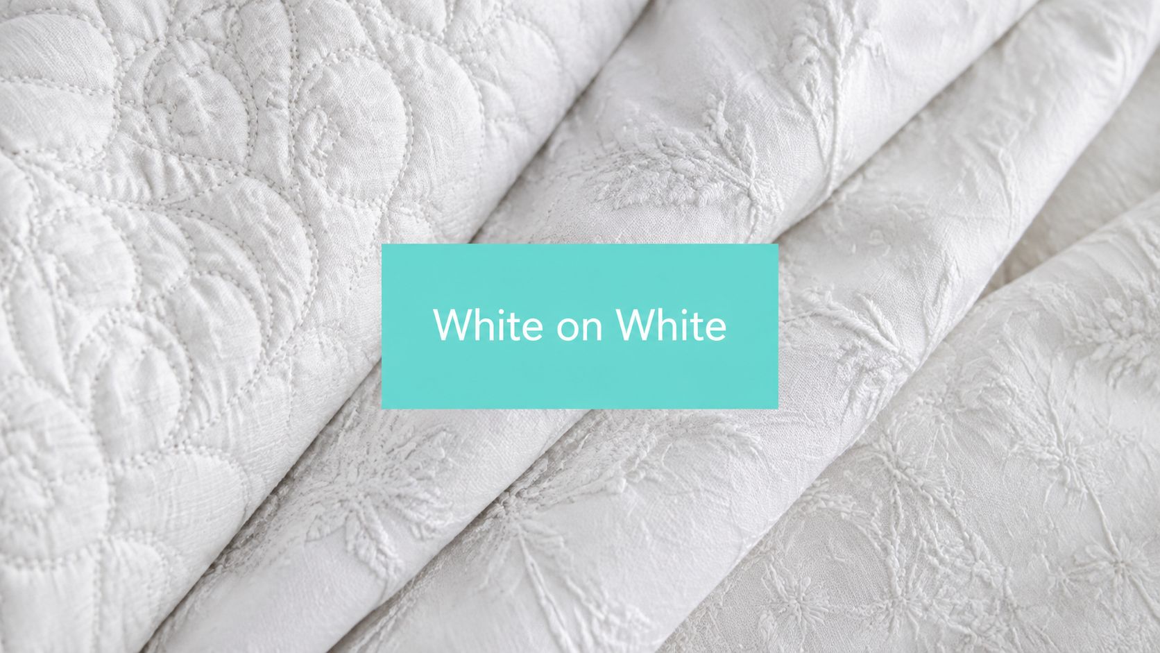
You've chosen a quiet quilt palette, but the plain white solid feels lifeless and a bold print feels too busy. White on white fabric solves that tension by adding pattern through texture, light, weave, and stitching rather than strong color contrast. The result looks calm from across the room and rewards a closer look.
Discovering the Magic of Tone-on-Tone Design
A quilter may begin with a simple goal: create a white quilt that feels finished, not empty. A solid white background can provide clarity, but it may not offer enough movement for a large block, border, or sashing. A bright floral print solves the movement problem, yet it can compete with carefully pieced blocks.
White on white fabric occupies the useful middle ground. It places a white motif on a white background, so the overall surface still reads as white while the design appears through a gentle difference in reflection and texture. This is the familiar tone-on-tone effect described by Missouri Star Quilt Co.’s white-on-white collection.

The eye reads the fabric differently as the viewing angle changes. A dot, vine, geometric repeat, or faint stripe may nearly disappear in diffuse light, then become distinct beside a window or under side lighting. That restraint makes white on white fabric valuable for backgrounds and sashings, where you want visual structure without interrupting the main design.
Why does the effect feel so polished?
The answer is controlled repetition. A tone-on-tone ground can echo the shape language of a quilt without introducing another hue, helping separate blocks while preserving a unified palette. It also gives hand quilting, machine quilting, embroidery, and appliqué a surface that can support detail without visual noise.
For color-planning ideas that extend beyond all-white palettes, our guide to modern quilt color schemes offers a useful way to think about contrast, balance, and focal points.
How to Make White-on-White Designs Actually Pop
White on white fabric doesn't become visible because the white is a different color. Its readability comes from low-contrast surface patterning, including changes in weave, finish, raised areas, and the direction of reflected light. Commercial white-on-white quilting cotton is commonly sold as premium 44-inch-wide fabric at about 60 square, or 120 thread count, so regularity in the weave matters greatly when the print relies on texture instead of pigment separation.
Use a small sample before cutting your quilt.
- Change the light. Lay the swatch flat under overhead lighting, then rotate it beside a window or lamp. Side light creates small shadows along the motif edges, revealing designs that looked absent under flat illumination.
- Add stitching with purpose. Quilting lines can reinforce the pattern by creating additional valleys and ridges. A simple parallel line, outline, or crosshatch may make a quiet print easier to read without overpowering it.
- Test thread value. White thread produces the most smooth, unbroken result, while a pale gray, cream, or another restrained value can give the quilting definition. The right choice depends on whether the stitched design should blend into the ground or become part of the surface pattern.
- Check the fabric after pressing. Heat, moisture, and pressure can change how a finish reflects light. Press a test piece, then inspect it again before committing to the full quilt.
Practical rule: Judge white-on-white fabric in the lighting where the finished quilt will live, not only beneath bright workroom lights.
Thread spacing also affects the optical result. Dense quilting can create stronger shadowing, while widely spaced lines may leave the printed motif responsible for nearly all the visibility. Our guide to stitch length for quilting can help you choose a rhythm that supports the fabric rather than flattening it.
Comparing Traditional Whitework and Modern Minky Textures
A white-on-white quilt can appear nearly blank under direct, flat light, then reveal its pattern as you tilt the fabric. Traditional whitework was built around this optical effect. These traditions developed across Europe, Scandinavia, and North America from the 16th to the 19th centuries, with especially strong popularity in 18th- and 19th-century Western Europe and the United States, as documented in this history of whitework.
Whitework artisans used white stitching on a white ground to form embossed, corded, stuffed, shadow, and drawn-thread effects. Raised thread changed the angle of reflection, while hollows collected tiny shadows. The design therefore emerged through weave, relief, and illumination rather than dyed color. That principle still guides quilters choosing a quiet cotton background.

What changes with Cuddle and Luxe Cuddle?
A woven cotton print keeps its surface comparatively flat. Its motif depends on thread arrangement, print registration, and the direction of light. Shannon Fabrics Cuddle and Luxe Cuddle fabrics create texture through plush pile, softness, and directional nap, so the hand and the eye read the surface together.
Textures such as Hide, Snowy Owl, and Fawn provide immediate tactile interest. They do not reproduce the precise, orderly effect of a woven background. Instead, they add warmth and sensory depth to a blanket, pillow, or quilt back.
| Material | Surface character | Useful strength | Main consideration |
|---|---|---|---|
| White-on-white quilting cotton | Flat, woven, low contrast | Crisp piecing and quiet backgrounds | Motifs may fade under flat lighting |
| Shannon Cuddle | Soft plush pile | Comfortable backs and blankets | Nap direction needs attention |
| Luxe Cuddle textures | More pronounced tactile surface | Decorative accents and luxurious throws | Cutting and handling require care |
Plush pile can also help address a common concern: seams showing through a quilt back. Its thickness may soften the outline of underlying construction, though seam allowance, pressing, and batting still affect the result. Review this guide to what Cuddle and Minky fabric is before choosing between a printed woven effect and a plush textile surface.
Strategies for Pairing and Contrasting Whites
A successful white palette contains differences that look intentional. Start by deciding which fabric will carry the visual attention. A patterned white-on-white cotton may lead the surface, while a plain white fabric supports it as a border or sashing.
How can you keep several whites from looking muddy?
Use contrast in surface, temperature, and scale rather than adding many competing motifs.
- Pair a crisp white with a warmer cream. The small temperature shift frames the brighter fabric and prevents the quilt from reading as one undifferentiated field.
- Place plush beside flat. A smooth cotton block next to a soft Cuddle border creates a tactile boundary even when both fabrics appear white.
- Reserve the busiest motif for a quiet location. A detailed white-on-white print works well in a border or background when the central blocks already contain strong shapes.
- Repeat one white deliberately. Repeating the same solid or texture in multiple locations makes the mix feel planned rather than accidental.
Sheen deserves attention, too. A matte cotton and a softly reflective plush fabric may look similar in a product photograph but behave differently in a room. Place swatches together, step back, and view them under both direct and indirect light.
For a practical look at solid options, compare the guidance in Shannon Fabrics Cuddle solid colors. The aim isn't to eliminate every difference. It's to give each difference a job.
Choosing the Right White Fabric for Your Project Type
A fabric choice should follow the project's job. A wall hanging benefits from a stable, crisp ground, while a baby blanket may need a soft plush reverse. A large quilt back adds another decision: how to preserve a calm white field without seams becoming the main visual line.
Traditional quilting cotton is commonly 42 to 45 inches wide. Wide-back quilting fabric is usually 106 to 108 inches wide and can reach 118 to 120 inches, according to Missouri Star Quilt Co.’s wide-backing information. Choosing a wider fabric can reduce or eliminate joins on a large back, so the design and finished width should be checked before cutting.
| Project need | Suitable choice | Why it works | Watch for |
|---|---|---|---|
| Detailed pieced blocks | White-on-white quilting cotton | It cuts and presses like familiar woven fabric | Test low-contrast motifs under project lighting |
| Large quilt back | Wide-back white-on-white fabric | Fewer joins keep the surface visually continuous | Confirm width and design direction |
| Soft baby quilt | White Cuddle or another plush minky | It adds comfort and tactile depth | Control nap and fabric stretch |
| Decorative pillow | Cotton front with plush accent | Different surfaces create layered texture | Test seam bulk before assembly |
| Heirloom-style surface | White cotton with detailed quilting | Stitching becomes the main design language | Sample thread and batting together |
White minky can create texture through pile and reflected light, while cotton relies more on weave, printed pattern, and quilting. That difference also affects seam visibility. Build a small layered sample with the top, batting, backing, and thread before committing to a large project.
For backing decisions, consult this guide on how to choose quilt backing, particularly when comparing a wide, quiet print with a pieced backing. The right fabric gives every layer a clear purpose.
Essential Care and Handling Tips for White Fabrics
A white quilt can show a fingerprint, loose thread, or colored lint before the first seam is sewn. Clean hands, a covered work surface, and protected storage preserve both brightness and the texture created by weave or pile.
How do you protect brightness and surface texture?
- Test before washing the full piece. Use an offcut to check shrinkage, surface change, and color stability.
- Keep plush nap facing one direction. Mark the nap on the wrong side with removable tape or a fabric-safe note. Consistent pile direction keeps reflected light even.
- Cover white yardage during storage. A clean, breathable fabric cover limits dust and contact with colored materials.
- Avoid improvised cleaning chemistry. Before trying homemade detergent, review BacteriaFAQ.com on Pseudomonas risks and follow the fabric manufacturer's care guidance.
White does not automatically mean opaque. A loose weave, pale batting, dark thread, or strong backlight can make seam allowances more visible. Plush minky adds another variable because its pile changes how light returns from the surface. The seam may disappear from one angle and appear from another. This quilting discussion about white fabric opacity and seam visibility reflects why quilters test these layers rather than judging the top fabric alone.
Build a small preview using the actual top, batting, backing, and thread. Hold it upright and inspect it under the lighting used in the finished room. Check both sides and several viewing angles. If the allowance remains prominent, try a less translucent batting, a brighter backing, or a different thread before cutting the full project.
Before quilting, inspect the sandwich. A short preview can reveal translucency that a single-fabric test cannot.
Project Ideas and Creative Applications
A wholecloth quilt gives white-on-white fabric its clearest role: one uninterrupted surface where quilting supplies the pattern. Whitework bedcovers became fashionable in the United States by the late 18th century, though one historical account says their popularity did not fully take hold until the 1790s. Classical ideals of unity and simplicity helped make all-white interiors desirable in the history of wholecloth quilts.

Choose an application that lets the weave, stitching, or pile do visible work:
- A wholecloth quilt: Use quilting lines to draw the pattern across a quiet fabric field.
- A baby blanket: Pair a woven top with a soft white plush reverse, then test the full sandwich to see whether seams show.
- A pillow front: Place a subtle cotton motif beside a textured border, allowing the design to register through touch and changing light.
- A modern wall hanging: Set appliqué or embroidery against white-on-white fabric so the surface remains calm.
- A large quilt back: Select an extra-wide fabric when fewer seams matter more than a pieced reverse.
Minky creates a different result. Shannon Cuddle can give a simple shape visual weight through its soft pile. Luxe Cuddle textures such as Hide, Snowy Owl, or Fawn make the reverse part of the design, because the pile changes how light reflects as the fabric moves. That effect can also soften the appearance of a seam, though the finished sandwich still deserves a test.
A short visual demonstration can help before cutting plush fabric. Watch the video below to observe how soft textured textiles behave in creative projects.
Start Your White-on-White Masterpiece Today
Begin with the project's purpose and the way light should move across its surface. Woven white-on-white cotton suits crisp seams and a quiet background. White Cuddle or a Luxe Cuddle texture brings warmth, softness, and visible pile. The right choice depends on how the finished piece will be used.
Use this preparation sequence:
- Define the surface. Decide whether quilting should carry the pattern or the fabric should remain a subtle motif.
- Order a sample when the finish matters. Compare whiteness, opacity, nap, and reflection under the lighting of the room where the project will live.
- Build a small sandwich. Use the top fabric you intend to work with, planned batting, thread, backing, and one representative seam.
- Inspect from several angles. Check for dullness, translucency, seam shadows, and shifts in plush direction. A seam may show through a smooth layer, while pile can scatter light and soften its outline.
- Cut only after the test succeeds. This protects your yardage and gives the final texture a fair trial.
For a branded studio or gift business, coordinated displays and packaging can reinforce a restrained palette. Subtle two-tone laser signage can identify the presentation without competing with a white-on-white surface.
On Pins & Needles Quilting Co. carries Shannon Cuddle, Luxe Cuddle, wide-back minky options, curated cuts, and kits. Its mail-in longarm service lets quilters package a quilt top, complete the order information, and send the project for finishing before it is returned. The shop also lists hundreds of verified reviews, a 15% first-order coupon, and free U.S. shipping on orders over $70.
A useful buying check: Match the fabric's surface behavior to the quilt's purpose, then test the complete layered sample before ordering for a large project.
White on white rewards patience. Light, weave, thread, batting, backing, and pile interact, so a single swatch cannot predict every seam or shadow. Test the full combination, then choose a cotton background, Cuddle backing, or Luxe Cuddle texture with confidence.
Use On Pins & Needles Quilting Co.’s Mail-in Longarm service when you want professional quilting without owning a longarm machine, and turn your tested plan into a finished quilt.