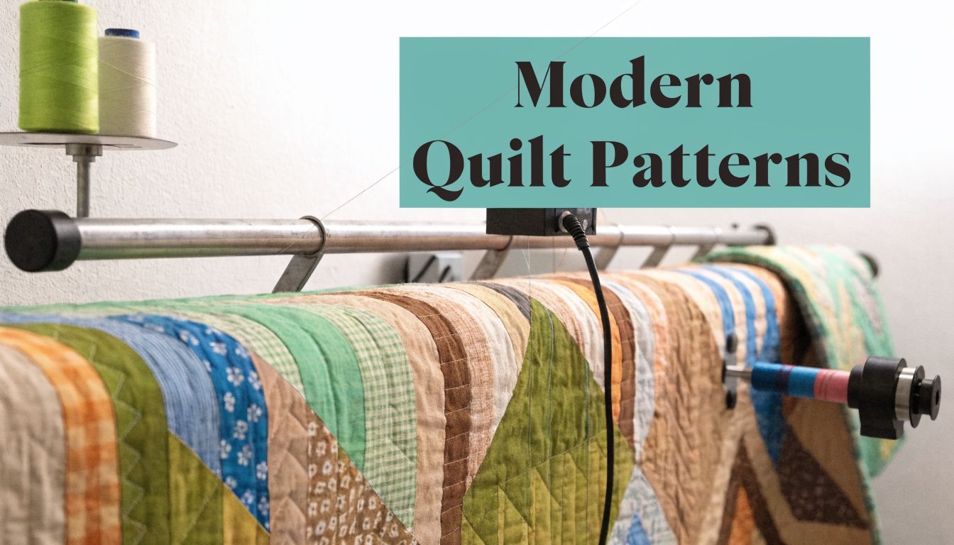
You've finished a modern quilt top, and now the last decision feels oddly high-stakes. The best longarm patterns for modern quilts are usually edge-to-edge designs with clear geometry, open movement, or simple organic structure that support the piecing instead of fighting it, especially if you're pairing the quilt with plush Shannon Luxe Cuddle or extra-wide minky backing.
Modern quilts usually look strongest when the quilting adds texture, rhythm, and drape without turning the surface into visual clutter. That's why we steer most quilters toward clean pantographs, careful scale, and pattern choices that respect both the top and the backing.
What Defines a 'Modern' Longarm Pattern
A modern longarm pattern doesn't have to be stark or severe. It just needs to feel intentional on a modern quilt top.

What does modern quilting look like in stitch form
Most modern pantographs fall into a few visual families:
- Geometric patterns bring order. Think grids, angled repeats, diamonds, plaid-like movement, and motifs with a clear structure.
- Botanical patterns soften a quilt without making it feel traditional. These tend to be stylized, airy, and less fussy than old-school florals.
- Abstract curves add motion. They work well when a quilt has hard piecing lines and needs a little visual release.
- Open meanders and linework create texture without overfilling negative space.
Professional longarmers have leaned heavily into this style. Industry surveys cited by the Longarm League show that geometric and botanical designs consistently rank among the top choices for versatility across quilt styles in modern edge-to-edge work, which is part of why they've become such a common recommendation for contemporary quilts in this Longarm League roundup.
That tracks with what we see at the machine. Modern piecing often has strong shapes already. The quilting doesn't need to add another loud layer.
A modern pantograph should read as texture first and motif second.
What usually does not read as modern
Some patterns are beautiful on the right quilt and wrong on a modern one. Dense feathers, ornate scrolls, and highly formal heirloom motifs can clash with graphic piecing unless the quilt intentionally mixes styles.
That doesn't mean curved or classic is off-limits. It means the quilting should match the quilt's design language.
A quick visual test helps:
- Look at the piecing from across the room. If the top reads bold and graphic, the quilting should usually stay disciplined.
- Check the negative space. Modern quilts often rely on open areas. Heavy filler can choke that effect.
- Notice the fabric story. Solids, linen-texture prints, and restrained palettes usually pair best with cleaner quilting lines.
If you want examples that stay in that lane, browse the Modern & Geometric pattern gallery. It helps to see how stitched repeats behave before you commit.
Why edge-to-edge works so well on modern quilts
Custom quilting can be stunning, but edge-to-edge is often the smarter choice for modern work. It gives the whole quilt a unified surface and keeps one block from shouting louder than another.
It also avoids a common mistake. Modern quilt tops already carry a lot of design intent. If every area gets a separate custom treatment, the finish can start to feel over-directed.
How Do I Match a Pattern Style to My Quilt Top
Pattern selection gets easier when you stop asking, “What's my favorite pantograph?” and start asking, “What does this quilt need?”
What works on a busy quilt top
If your top has small pieces, strong contrast, or a lot of print, choose a pattern that calms the surface.
In one professional roundup, Soho, Diagonal Plaid, Malachite, and Marmalade were repeatedly recommended for versatility, ease of use, and a balance of straight-line structure with gentle curves in the Longarm League's top modern pantograph list. That balance matters on busy quilts because it adds movement without adding mess.
Busy tops usually do best with:
- Simple repeats that don't ask the eye to process another layer of complexity
- Moderate density so the top still breathes
- Continuous-path designs that stay smooth and even across seams and color changes
A plaid-inspired or gently curving geometric often does more for a pieced modern quilt than a highly decorative motif.
What works on a minimalist quilt top
Minimalist quilts give the quilting more room to speak. If your top uses solids, oversized blocks, or broad negative space, the stitching can carry more personality.
That's where you can choose:
- Bolder linework
- Larger repeats
- Patterns with stronger graphic identity
A modern botanical, a structured fan, or an abstract repeat can all work well here. The quilting becomes part of the design language instead of disappearing into it.
On quilts with lots of negative space, the wrong pattern doesn't hide. You see every decision.
A quick decision guide
| Quilt top style | Pattern direction | What to avoid |
|---|---|---|
| Busy piecing, multi-print, high contrast | Open geometric, soft linework, moderate density | Tiny intricate motifs |
| Large solids, open negative space | Larger-scale pattern with stronger texture | Overly sparse quilting that looks unfinished |
| Mixed modern piecing with both prints and solids | Versatile allover with balanced curves and structure | Highly formal traditional motifs |
If you're narrowing options, the full OPN pattern gallery is useful because you can compare styles side by side instead of guessing from pattern names alone.
A practical note from our own longarm workflow: if a modern top already has strong directional piecing, we often avoid a quilting design with equally aggressive direction unless that tension is intentional. Parallel energy can look sharp. It can also look rigid fast.
What Is the Right Scale and Density for My Quilt
Scale and density decide whether a good pattern looks polished or off. These elements often pose challenges for many modern quilts.

How should scale relate to the quilt top
The pattern's repeat needs to match the quilt's dominant visual scale. If the piecing is large and architectural, a tiny quilting design can make the surface feel gritty. If the piecing is small, an oversized motif can become unreadable.
That's why longarmers calibrate carefully. A practical modern workflow is to set row height, calculate pattern height from the gap, and adjust offset to avoid visible drift, as shown in this setup example for Best Fronds.
That same published example used a 40" x 40" test quilt with a 5" row height, a -4.259" gap, a 9.259" pattern height, and 50% offset, with the note that row height plus the gap equals pattern height in that setup. Those aren't universal settings. They're a good reminder that even attractive modern patterns need precise setup to stitch cleanly across a full quilt.
Why density changes the feel of the quilt
Density isn't just a visual choice. It changes hand, loft, and drape.
Use this rule of thumb:
- Lower density keeps a quilt softer and more flexible
- Moderate density gives a tidy, balanced finish for most bed quilts
- Higher density creates a flatter surface and stronger texture definition
That matters a lot if the quilt is meant to be cuddled, folded, washed, and used often. A wall quilt can tolerate more compression. A couch quilt usually wants more softness.
Practical rule: Choose density based on the quilt's job, not just the pattern preview.
For quilts backed in plush fabric, this decision matters even more. If you're weighing options specifically for soft backings, our article on edge-to-edge quilting patterns for minky is a helpful companion.
What errors show up when scale is wrong
Three problems show up again and again:
-
The quilting competes with the piecing
This happens when a strong geometric motif is stitched too small on a graphic quilt. -
The pattern loses its identity
This happens when a beautiful repeat is blown up so much that the eye can't read the rhythm. -
Rows drift visibly
Small mistakes in gap or offset compound across the quilt and create uneven spacing.
A short visual demo helps if you like seeing these adjustments in action:
A usable scale check before you commit
Before quilting a customer top or a quilt you've spent months piecing, we recommend a small sample whenever the motif is unfamiliar.
Check these points:
- Block relationship. Does the repeat echo the piecing or interrupt it?
- Texture level. Does the stitched sample look calm, lively, or chaotic?
- End use. Does the density support drape, structure, or warmth the way you want?
Will My Fabric and Batting Choice Affect the Pattern
Yes. Fabric, backing pile, and batting loft all change how a pantograph reads once the quilt is off the frame.

A modern pattern that looks crisp on a cotton-backed sample can soften dramatically on Shannon Luxe Cuddle or another high-pile backing. The stitches sink into the nap, the edges of the motif look less sharp, and dense areas can flatten the plush feel that made you choose minky in the first place. That trade-off matters. Modern quilts usually rely on clean lines, open space, and controlled texture.
Why cotton and plush backing behave differently
Cotton shows stitch definition clearly. Plush backing shows texture first.
That is the key choice to make with minky-backed modern quilts. If the goal is a pattern you can read from across the room, give the design more space than you would on a standard cotton backing. If the goal is a soft, velvety finish with a subtle stitched surface, a gently textured allover design often does the job better than a tight geometric repeat.
I see this most often on bold, graphic tops. A square maze, sharp angular line, or small-scale geometric can look polished on flat cotton. Put that same pattern over Luxe Cuddle Hide, Snowy Owl, or Fawn, and the effect shifts. The quilting is still there, but the backing softens the definition and changes the mood.
Which modern patterns tend to work best on minky
For high-pile backings, the safest modern choices usually share one trait. They leave room for the fabric to stay plush.
Patterns that usually work well include:
- Open linework with clear travel paths
- Gentle curves that create movement without compacting the backing
- Medium-scale graphic repeats that still read after the pile settles around the stitches
- Directional organic designs that add texture without making the quilt feel stiff
Patterns that need more caution include:
- Tiny, dense motifs that disappear into the backing
- Intricate fills that can make the quilt feel heavy and overworked
- Closely spaced sharp geometry when the quilt is meant to stay soft and drapey
Dense quilting is still an option on plush backing. It just needs to be a deliberate choice for structure, not the default.
On minky, the best modern pattern is often the one that reads clearly with fewer lines.
Batting changes the result too
Batting affects loft, drape, stitch definition, and how much the quilting sinks into the backing. A low-loft cotton batting tends to keep the surface flatter and helps modern linework show more clearly. A loftier batting can add beautiful dimension, but it also softens the edges of the design and can make a detailed pattern feel busier than expected.
If you are still sorting through loft and fiber options, this guide to what quilt batting does and how it changes the finish will help you choose with the final quilting texture in mind.
The combination matters as much as the individual parts. Cotton top plus cotton backing plus low-loft batting gives the sharpest read. Cotton top plus Luxe Cuddle backing plus loftier batting gives a softer, puffier surface, which usually benefits from simpler quilting.
What to watch with extra-wide plush backings
Wide minky backings create a beautiful uninterrupted field on the back of the quilt. They also make pattern scale more obvious because there is no seam breaking up the design.
On a clean modern quilt, that can work for you or against you. A busy motif can make the back feel crowded, especially on solid or lightly textured plush. A pattern that is too open can look unfinished. Medium-to-open scale is usually the sweet spot, especially when the backing is part of the quilt's visual appeal and not just a practical choice.
Here is a simple pairing guide:
| Backing choice | Pattern direction | Likely result |
|---|---|---|
| Flat cotton | Geometric, detailed, or moderate-density botanical | Crisp stitch definition |
| Luxe Cuddle Hide | Open geometric or directional organic linework | Visible texture with soft drape |
| Luxe Cuddle Snowy Owl or Fawn | Airier curves or moderate allover texture | Plush feel with stitched dimension |
| Extra-wide plush backing | Medium-to-open scale | Balanced look across a broad backing field |
If the backing is the reason the quilt feels irresistible, choose a pattern that supports that softness instead of quilting it flat.
How Do I Use the OPN Pattern Gallery to Finalize My Choice
Too many options can freeze a decision. A curated gallery solves that by showing real stitched possibilities instead of leaving you with only names and guesses.
Where should you start in the gallery
Digital pantograph libraries have grown quickly, and curated pattern galleries have become more important because quilters need help sorting through a large selection with confidence, as discussed in Then Came June's review of modern pantograph curation.
Start with patterns that fit the quilt's overall voice. If the top is clean and graphic, begin with modern, geometric, and lightly organic options before you wander into denser floral categories.
A strong workflow looks like this:
-
Filter by style first
Ignore holiday, juvenile, and novelty motifs unless the quilt clearly calls for them. -
Study the stitched path
Look for whether the design travels smoothly and whether the repeat feels calm or busy. -
Imagine the backing, not just the top
This step matters if you're using minky, wide back, or a loftier batting.
What should you compare before deciding
When we evaluate a pantograph for a modern quilt, we compare four things at once:
- Visual density
- Directionality
- Scale flexibility
- How clearly the motif will read on the chosen backing
That last point gets skipped a lot. It shouldn't.
If you want more visual examples before choosing a service pattern, the computerized longarm quilting gallery article helps show how digital designs translate from preview to stitched result.
How to narrow from many patterns to one
Use a short elimination test.
| Keep it if... | Remove it if... |
|---|---|
| It supports the piecing | It fights the piecing |
| It still looks good at a simpler scale | It only works if stitched tiny |
| It makes sense on your backing fabric | It depends on crisp cotton definition |
| You'd be happy seeing it across the whole quilt | You only like one small section of it |
The right modern pantograph should feel obvious after this pass. Not trendy. Not dramatic in the preview. Obvious on the quilt.
Our Top 5 Modern Pattern Recommendations for 2026
These are the styles we reach for most often when a quilter wants a modern finish without regret six months later.

Which patterns earn repeat use
Some patterns are exciting once. Others keep working across very different tops. Those are the useful ones.
Here's the quick comparison.
| Pattern Name | Aesthetic | Best For Quilt Tops That Are... | Minky Compatibility |
|---|---|---|---|
| Gridwork Flow | Clean, linear, restrained | Minimalist, geometric, high negative space | Good if kept open |
| Wavy Stitch | Soft movement, modern organic | Busy piecing, mixed prints, improv blocks | Very good |
| Nested Loops | Rounded, contemporary texture | Solids, balanced modern patchwork, softer palettes | Very good |
| Exploded Star | Energetic, open, graphic | Bold modern piecing, asymmetrical layouts | Good on lower-to-medium loft looks |
| Modern Meander | Easy allover texture with a fresh feel | Everyday quilts, relaxed modern tops, gift quilts | Excellent |
1. Gridwork Flow
This is the one to pick when the quilt top already has architectural confidence. It adds order and texture without dragging the eye away from the piecing.
It shines on tops with:
- strong block structure
- large areas of solids
- modern palettes with clear contrast
On plush backing, keep it open enough that the linework still reads. If it gets too tight, the geometry can blur.
A practical pairing if you're shopping backing at the same time is extra-wide minky backing options, especially when you want a smooth modern finish on a larger quilt.
2. Wavy Stitch
This is one of the safest choices for a modern quilt that feels busy, angular, or high contrast. Gentle wave motion softens hard piecing beautifully.
It's especially useful when:
- the top has lots of seam intersections
- the fabrics already create strong motion
- you want texture, not a second pattern contest
On Shannon Cuddle or Luxe Cuddle, this kind of pattern often reads better than a tight geometric because the curves remain visible even as the plush surface softens the stitch path.
3. Nested Loops
Nested Loops gives you contemporary texture without looking precious. It's a great middle-ground pattern when you don't want a strict grid and you also don't want a classic meander.
Choose it when the quilt needs:
- softness without sentimentality
- continuous movement
- a modern surface that still feels approachable
This style works nicely with plush textures used for throws and comfort quilts, especially if your goal is drape.
4. Exploded Star
This is the boldest option on the list. It suits tops that already have a strong modern identity and can support a more graphic allover design.
Use it on:
- improv quilts
- asymmetrical layouts
- tops with intentional negative space and bold shape language
I'd be more selective with this one on high-pile backing. If the quilt is meant to stay extra soft, a more open or curvier design usually behaves better.
5. Modern Meander
A good modern meander is not the same as an old-school allover squiggle. The modern version has more breathing room and a more deliberate path.
It's often the right answer when:
- the quilt is meant for regular use
- the top needs low-risk texture
- the backing is plush and you want softness to stay front and center
For projects built around softness, Shannon Luxe Cuddle fabrics are a natural companion because the quilting creates touchable dimension instead of a stiff surface.
The most reliable pattern is often the one that looks slightly quieter in the preview and much better on the finished quilt.
If you're buying for a specific backing mood, Hide texture selections, Snowy Owl Cuddle options, and Fawn Cuddle textures all behave a little differently under stitching, so it's worth matching the pantograph to the pile.
How Should I Prep My Quilt for Mail-In Service
Good prep makes quilting smoother and prevents avoidable delays. It also helps the finished pattern look the way you intended.
What should you do before packing the quilt
Use this checklist:
-
Press the quilt top well
Flat seams load better and quilt more evenly. -
Trim loose threads
Dark thread tails can shadow through light fabrics. -
Mark the top edge if the quilt is directional
A safety pin and small note are enough. -
Check that seams are secure
Open spots can widen under machine tension. -
Leave the basting to the longarmer
Don't pin the sandwich together unless your service specifically requests it.
What matters most for modern quilts
Modern quilts are less forgiving of distortion because the piecing is usually graphic and orderly. Wavy borders, stretched backs, and poorly pressed seams show up faster than they do on a visually busy traditional quilt.
For minky-backed quilts, make sure the backing is cut generously and packed neatly. Plush fabric can shift and crease more than quilting cotton if it's shoved into a small box.
A clean quilt top gives the pantograph a fair chance to look polished.
If you also need backing for the project, 90-inch Cuddle backing and 110-inch extra-wide Cuddle can help eliminate pieced backing seams on larger quilts.
Quilters also appreciate clear logistics. We know that matters, especially on mail-in jobs. That's one reason we keep prep expectations straightforward and why our shop has hundreds of verified reviews from customers who want a smooth finish, not extra guesswork.
Frequently Asked Questions About Modern Longarm Patterns
You have the quilt top finished, the backing picked, and two pantographs still fighting for the final vote. That is usually when the practical questions show up. On modern quilts, small choices matter more because clean piecing leaves very little room for quilting to hide.
The questions below come up often, especially on quilts headed for a plush minky or Shannon Luxe Cuddle backing where softness, stitch definition, and drape do not behave the same way they do on a cotton-backed quilt.
| Question | Answer |
|---|---|
| Can I use a traditional pattern on a modern quilt? | Yes, if the line quality stays clean and the scale fits the top. A simple traditional motif can work beautifully on a modern quilt, but fussy feathers or overly ornate curves often compete with bold piecing. |
| What thread color works best on modern quilts? | Blending thread is the safest choice when the piecing is the star. If you want the quilting to show, choose contrast on purpose and accept that every wobble, point change, and direction shift will read more clearly. |
| Are geometric patterns always the best longarm patterns for modern quilts? | No. Geometric quilting suits many modern tops, but some quilts need contrast. Organic lines can soften a hard-edged design and keep the whole quilt from feeling stiff. |
| What if my quilt has a minky or Luxe Cuddle backing? | Choose with loft in mind. Open to medium density usually preserves more softness, and simple motifs tend to read better than very intricate ones because the pile softens fine detail on the back. |
| Can quilting be too dense for a cuddle quilt? | Yes. Dense quilting gives more structure and can help tame a very lofty quilt, but it also reduces puff, drape, and that extra-soft hand people usually want from cuddle-backed quilts. |
| Should I pick the backing before the pattern? | Yes, if possible. A pantograph that looks great on cotton can feel too tight on plush backing, so it helps to make those decisions together instead of treating the backing as an afterthought. |
| Do I need a custom pattern for a modern quilt to look high-end? | No. A well-scaled edge-to-edge design often looks sharper on a modern quilt than custom quilting that adds too many competing lines. |
| What if I can't decide between two patterns? | Pick the one that supports the piecing without stealing focus. In practice, quilters are more likely to regret a pattern that shouts than one that quietly finishes the quilt well. |
One point deserves extra emphasis. Plush backing changes the result. On Luxe Cuddle and other high-pile backings, the quilting texture on the back will look softer and less crisp than it does on a flat cotton backing, so intricate detail is rarely the best place to spend your density.
If you are choosing supplies at the same time, it helps to decide on backing, batting feel, and pantograph as one finish plan. That is especially true for gift quilts and everyday-use throws, where softness and washability matter as much as the front design.
For anyone still gathering supplies, quilt kits and ready-to-sew project options can simplify the next project before it even reaches the quilting stage.