

When a quilt backing feels too flat, or a room needs softness without another busy print, grey ombre fabric gives you a controlled light-to-dark transition that adds depth while keeping the palette calm. It works especially well when you match the gradient scale and fabric texture to the project, rather than choosing by color alone.
Introduction That Answers What Grey Ombre Fabric Does for You
You may be holding a quilt top with plenty of movement and wondering how to finish it without competing with the piecing. Or perhaps you're choosing fabric for a throw, pillow, apparel piece, or nursery project and want something more dimensional than a solid grey.
Grey ombre fabric solves that design problem by combining a neutral palette with gradual tonal movement. The eye reads the fade as surface depth, so the fabric can support a colorful quilt, soften a modern room, or give a simple handmade item a more finished appearance without adding a hard geometric pattern.
The important word is gradual. A successful ombré design moves smoothly between shades. It shouldn't look like separate grey stripes unless that's the intended print. The result can be quiet and versatile, but the wrong gradient can become muddy, disappear in low light, or lose its character when placed across seams.
Our approach at OPN Quilting is practical. We look at how a fabric behaves under a needle, across a quilt back, beside plush textures, and in ordinary household light. That same hands-on thinking informs our modern quilt color schemes guide, where tonal relationships matter as much as individual colors.
You'll find the most useful answers below:
- For quilt backs: Choose a gradient that complements the quilt top and place seams where they won't interrupt the fade.
- For plush throws: Consider pile height first, because texture can soften or obscure tonal changes.
- For apparel and décor: Check drape, opacity, and the way grey changes beside warm wood, white walls, or darker furnishings.
- For buying: Match the fabric width and cut to the project before you fall in love with a colorway.
OPN Quilting serves makers who want premium minky fabrics and professional finishing options, including Mail-in Longarm quilting. Our shop is supported by hundreds of verified reviews, and we'll use the same straightforward decision-making here that we use when helping quilters choose backing, texture, or finishing.
What Grey Ombre Fabric Is and How the Gradient Is Made
Ombré fabric is a smooth progression from one shade to another, commonly moving from pale to dark. In grey, that may mean a transition from silver or mist to charcoal, although the exact starting and ending tones vary by fabric and process.
A useful analogy is a dimmer switch rather than a row of light bulbs. A striped fabric changes abruptly from one area to the next, while ombré adjusts the color continuously. That difference affects how the cloth looks when it's folded, draped, pieced, or stretched.
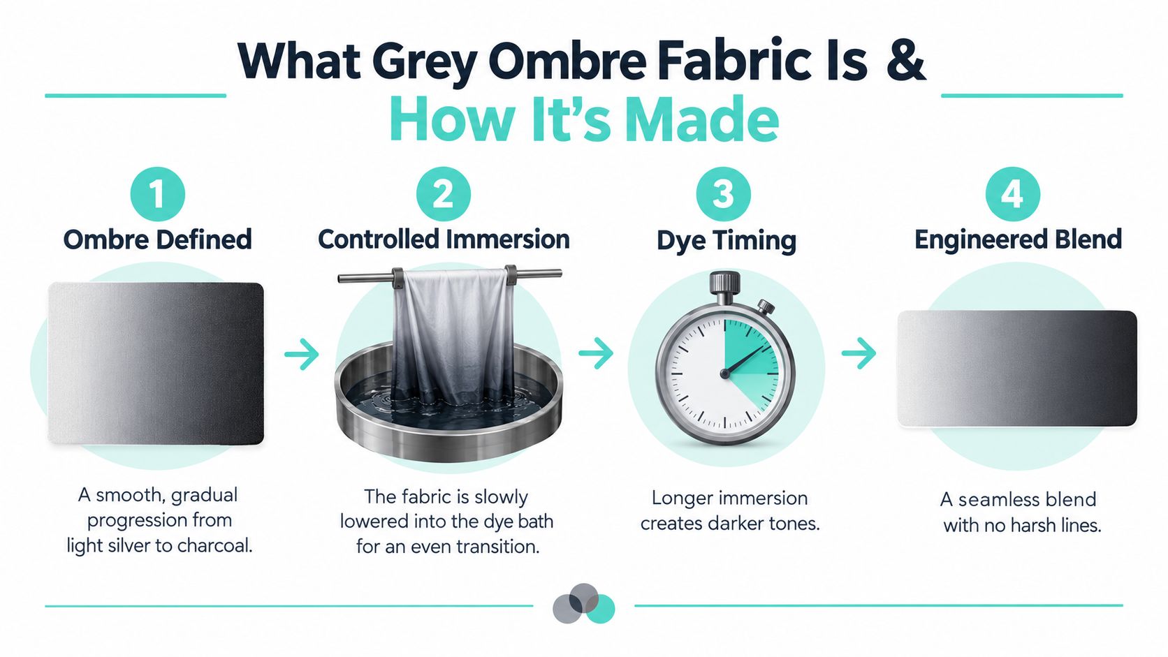
How does controlled immersion create the fade?
In dip-dyeing, the fabric is held vertically and lowered into a dye bath in stages. The lower portion spends more time exposed to the dye, so it develops greater color depth while the upper portion remains lighter. Textile Tuts describes this staged immersion process and notes that a tall vessel and low-agitation workflow help preserve an even transition.
A practical tutorial recommends beginning with only a short section in the dye bath, then lifting the fabric in 6-inch increments every 5–10 minutes, followed by rinsing from the lightest area toward the darkest area. Those exact steps are outlined in this incremental ombré dip-dye tutorial.
The timing matters because dye exposure builds gradually. One example uses a fabric dipped 3 inches, then lowered by another 3 inches after 20 minutes to create multiple shades, as explained in Diane Kroe's overview of ombré technique.
Why does grey require careful control?
Grey looks simple, but small shifts in saturation can change its character. A controlled fade may read as airy and silver at one end, balanced in the middle, and grounded at the darker edge. Too much agitation or inconsistent dwell time can compress the tonal range and make the transition look dull.
The design also belongs to a long textile lineage. French ombré wallpapers and textiles appeared in the 1820s, and historical textile printing used special “rainbowed” blocks to create graduated effects, according to this account of ombré patterns from 1820 to 1850.
That history explains why grey ombre fabric feels both traditional and current. It continues an established dye-and-print approach, while the neutral color makes it comfortable in contemporary quilts, apparel, and interiors. For background on plush materials and their construction, OPN's guide to what Cuddle minky fabric is is a helpful companion.
Types of Grey Ombre Fabric You Will Find Today
Grey ombre can describe several unlike materials. Printed cotton, yarn-dyed cloth, plush dip-dyed minky, and digitally printed décor fabric may share a colour family, yet their surfaces create different project results. The useful comparison starts with the fabric, not the product photograph.
A screen can show the fade, but it cannot fully reveal pile, stretch, opacity, or drape. Those traits decide whether the gradient stays crisp after quilting, softens under a plush surface, or changes as light moves across it.
How do the main fabric types compare?
| Fabric Type | Gradient Method | Pile and Drape | Best Use Case |
|---|---|---|---|
| Printed cotton ombre | Printed or engineered colour transition on a flat surface | No pile, structured drape, clear colour reading | Quilt piecing, quilt backs, pillows, apparel |
| Yarn-dyed gradient | Colour is built into yarn placement or tonal arrangement | Usually flat to lightly textured, stable hand | Woven décor, structured garments, selected quilt details |
| Dip-dyed minky | Controlled immersion creates darker and lighter areas | Plush pile, flexible drape, softened visual edge | Throws, quilt backs, blankets, cuddly accents |
| Digital-print interpretation | Image-based printing reproduces a graduated effect | Depends on base cloth, often flat or lightly textured | Apparel, décor panels, craft projects |
A low-pile fabric usually presents grey transitions more clearly. Higher pile catches light on individual fibres, so the same grey may appear lighter, warmer, or less defined when the nap changes direction.
For plush choices, browse the Shannon Luxe Cuddle collection. Hide, Snowy Owl, and Fawn alter more than hand feel. Their textures can either support the ombré or draw attention away from a delicate fade. Use a flatter surface when you need the gradient to read as a clear design element. Choose a more pronounced pile when softness and tactile depth matter more than precise colour boundaries.
What should you compare besides colour?
Check opacity for apparel, curtains, and lightweight décor. Review pile, because raised fibres can blur a subtle transition. Consider drape as well. A soft fabric may spread the gradient across folds, while a firm cloth keeps the colour zones more controlled.
Gradient scale affects the finished mood. A long, gentle fade can keep a quilt back calm and give a large throw quiet movement. A compressed fade creates stronger bands and may compete with a busy quilt top. For upholstery projects, the upholstery fabric types guide offers a useful way to compare construction and intended use beyond colour.
How to Style Grey Ombre in Quilts and Home Decor
A grey gradient earns its place when it solves a visual problem. It can calm a lively quilt top, give a plain throw more movement, or ground a room that has plenty of pattern but needs a quieter textile layer.
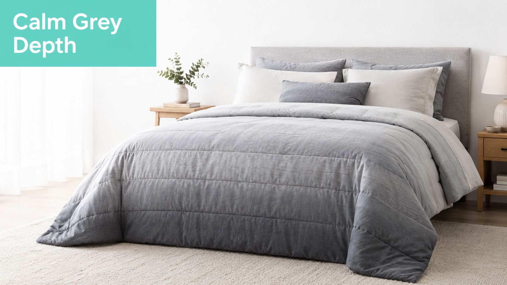
How can grey ombre improve a quilt back?
Suppose your quilt top has strong blocks, multicolor scraps, or a directional design. A grey ombré back can provide movement without introducing a competing motif. The fade acts like a broad brushstroke, giving the back interest while allowing the front to remain the star.
Seam placement deserves attention. If the backing isn't wide enough, place the seam along a less dramatic part of the transition, or choose a gradient whose tonal change can tolerate interruption. Before cutting, lay the fabric flat and mark the light and dark ends so you know which direction the fade will run across the finished quilt.
Plush backing adds another decision. A low-pile Cuddle surface may preserve more of the gradient's definition, while a more textured Luxe Cuddle surface can create a softer, tactile interpretation. OPN's Mail-in Longarm service can help finish a prepared quilt top when you want professional edge-to-edge quilting without using your own longarm machine.
Practical rule: If the quilt top already has high contrast, use the ombré as a quiet field. If the top is very subdued, choose enough gradient range to keep the back from looking flat.
Where does the fabric work in home décor?
A grey ombre throw can bridge warm and cool elements in a room. It pairs naturally with wood, cream, white, black, and muted color accents, but the exact effect depends on the lighting. A cool grey may appear crisp near daylight and heavier under warm lamps.
Pillows are a good place to test a gradient because a small finished surface reveals whether the transition remains readable after folding and stuffing. For nursery décor, the softness can create a calm foundation, while a darker end placed on the lower portion of a throw may be more forgiving in everyday use.
You can also use the fabric for scarves, garment panels, or simple accessories. In those applications, inspect both sides and consider how movement will rotate the gradient around the body.
This video offers another visual reference for how an ombré surface can be approached in a textile project:
A buying pause: Before ordering, decide whether you want the gradient to be the feature or the supporting background. That one choice usually determines whether a flat cotton, low-pile Cuddle, or deeply textured Luxe Cuddle will serve you better.
Shop note: New customers can use the 15% first-order coupon, and orders over $70 qualify for free U.S. shipping. Those offers can be useful when you're pairing backing fabric with batting, thread, a kit, or coordinating textures.
Which Luxe Cuddle Texture Pairs Best With Grey Ombre
Grey ombre fabric can look understated beside a flat solid, but the right plush texture adds dimension without forcing a new color into the design. The choice depends on whether you want the gradient to remain legible, feel extra cozy, or provide a subtle tactile contrast.
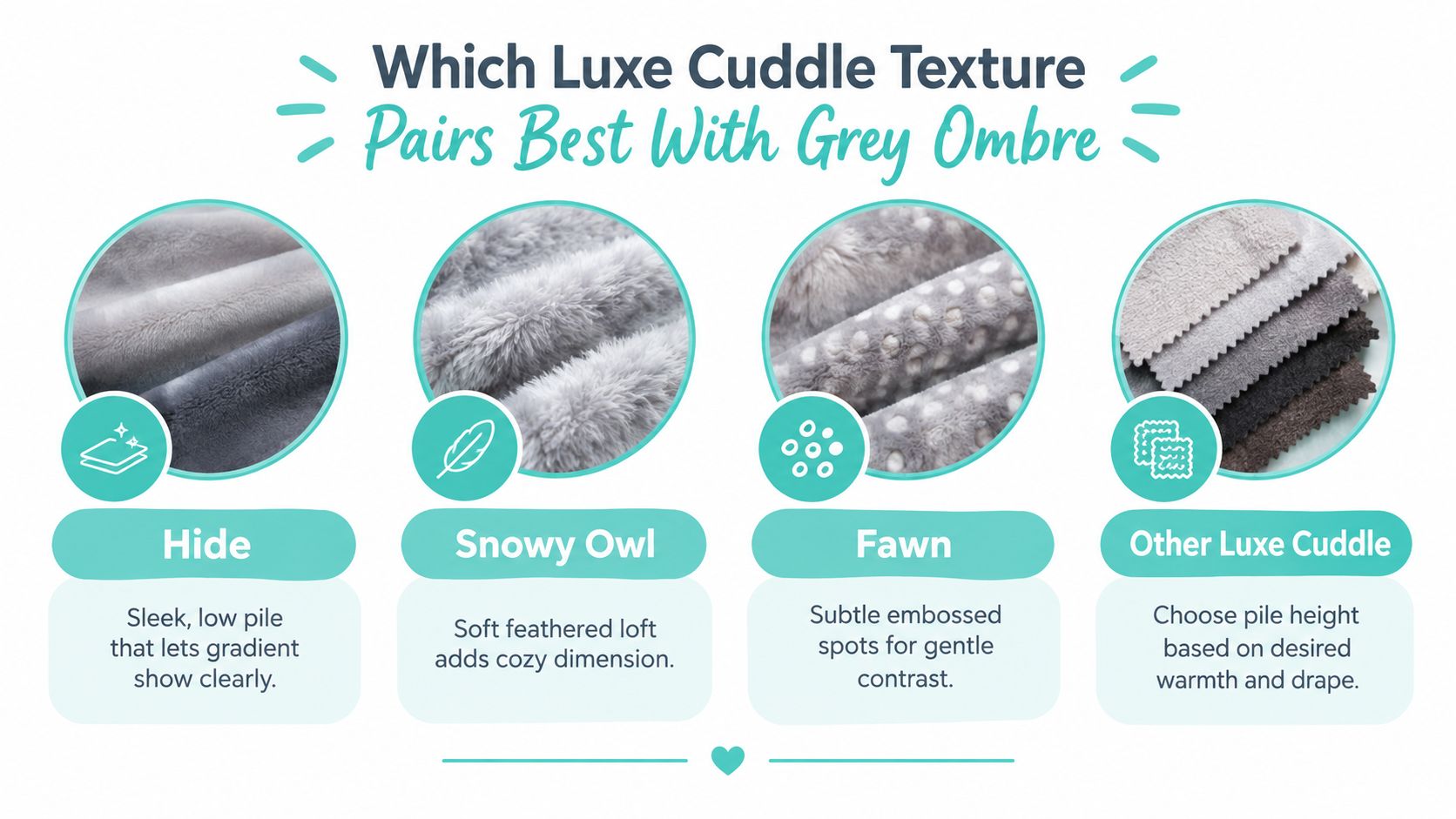
Which texture should you choose?
| Texture | Surface Character | What It Does Beside Grey Ombre | Suitable Role |
|---|---|---|---|
| Hide | Smooth, short pile | Keeps the tonal transition comparatively clear | Quilt backing, sleek throws, modern accents |
| Snowy Owl | Feathery, lofted surface | Adds cozy dimension and diffuses the fade | Plush throws, winter accents, tactile décor |
| Fawn | Velvety surface with embossed spots | Creates gentle contrast without a loud print | Pillows, baby items, accent panels |
| Other Luxe Cuddle textures | Varies by pile and pattern | Lets you control warmth, movement, and visual softness | Backing or accent, depending on scale |
Hide is a sensible choice when you've selected grey ombré specifically for its gradient. Its shorter surface tends to let more of the tonal design remain visible, which helps in rooms where low light already reduces contrast.
Snowy Owl changes the emphasis from graphic fade to touchable warmth. The feathered loft can soften the visual transition, so it's better when the finished piece should feel plush first and precisely graduated second.
Fawn sits between those approaches. Its surface variation gives a quiet pattern beside the ombré, making it useful when a solid plush would feel too plain but a strong print would distract.
OPN's article on creating texture in quilt projects provides useful guidance for thinking beyond color. Our Luxe Cuddle Hide fabric is a specific option to consider when a sleek, low-pile finish matters, while Luxe Cuddle Fawn suits makers who want more tactile surface interest.
How to Choose Width Yardage and Quality Before You Buy
A grey ombré backing should be planned from the finished project outward. A narrow cut can create an unwanted center seam, while a wider piece may keep the gradient calm and uninterrupted. That choice affects both appearance and quilting time.
Which width fits the project?
Use these options as a starting point:
- Extra-wide 90-inch fabric: Suitable for broad quilt backs when you want to avoid piecing across the center.
- Extra-wide 110-inch fabric: Intended for very large backings where a one-piece layout matters.
- Standard 58–60-inch fabric: Practical for piecing, apparel, pillows, and smaller sewing projects.
- 80-inch Mirage: A curated width for soft drape and a stable backing format.
Measure the quilt top, then allow extra fabric for quilting and secure handling. Plan the gradient before cutting, too. The darker end might run toward the head, foot, side, or center, and each placement creates a different visual balance. A broad gradient can calm a quilt back, while a smaller panel may need enough contrast to remain visible after folding or shaping.
Use OPN's guide to calculating yardage for quilts for a more detailed calculation method. If the fabric must withstand repeated washing, compare its construction and care needs with guidance on the best weave for washable quilts.
What quality checks prevent disappointment?
View the fabric from several angles and under more than one lighting condition. A smooth transition should read as a gradual fade rather than an abrupt stripe. Check the darkest section closely as well, since heavy saturation can hide unevenness or make the edge appear harsher than expected.
Dye performance depends on several interacting conditions, including dye concentration, salt, alkali, temperature, and fixation chemistry. One textile study varied dye concentration from 1% to 9%, salt from 20 g/L to 40 g/L, alkali from 5 g/L to 10 g/L, and temperature from 40°C to 80°C, while holding dyeing time at 45 minutes. It also reported that concentrations above 2.6% could reduce colorfastness and process efficiency while increasing cost. The textile study details those variables and their relationship to dye performance.
Use that information as a practical quality check, not as a reason to choose the darkest grey available. Ask whether the fabric has been wash-tested, and if you dye at home, rinse thoroughly. Maximum saturation does not automatically produce the most durable gradient.
OPN offers curated 2, 2.5, and 3 yard cuts, strip bundles, and kits alongside yardage. Accurate cutting and secure checkout help when the light-to-dark transition must align with a planned backing or decor project.
Your Next Steps to Shop Grey Ombre With Confidence
Start with the finished project in mind. For a quilt back, a wide, quiet gradient can keep the surface calm. A pillow or apparel panel may need a smaller-scale transition that remains visible after folding, shaping, or quilting.
Then match the pile to the result. Flat cotton keeps the fade crisp. Hide holds more visual definition on plush projects, while Snowy Owl or Fawn adds tactile contrast when the grey gradient feels too restrained. A tall pile can soften the shift and reduce contrast, especially in a dim room.
Use this checklist before ordering:
- Mark the light and dark ends. Decide how the gradient will run across the finished piece.
- Measure the project. Confirm the fabric width and required yardage before cutting, so an avoidable seam does not interrupt the design.
- Assess the lighting. Grey may lose separation in low light, particularly beneath a high pile.
- Choose a coordinating texture when needed. A subtle plush contrast can make a quiet backing feel deliberate rather than flat.
- Plan the finish. If you are sending out a quilt, review the preparation details for Mail-in Longarm quilting before shipping it.
Compare grey and neutral fabrics with plush options before committing. For a ready-made gift, minky blanket options provide softness without requiring you to cut and sew the full project.
Grey ombre works well when neutral color, gradient scale, pile, and available light support the intended use. It can weaken a design when the fade is too broad, the pile hides the transition, the width forces an unwanted seam, or the room is too dark.
Get 15% Off Your First Order
Luxe Cuddle Collection
On Pins & Needles Quilting Co. offers grey ombre fabric, Shannon Cuddle and Luxe Cuddle textures, curated cuts, and Mail-in Longarm finishing for quilt projects. Visit On Pins & Needles Quilting Co. to choose fabric, use the first-order offer, and begin your next quilt or décor project with a clear plan.